Feb - Mar 2023
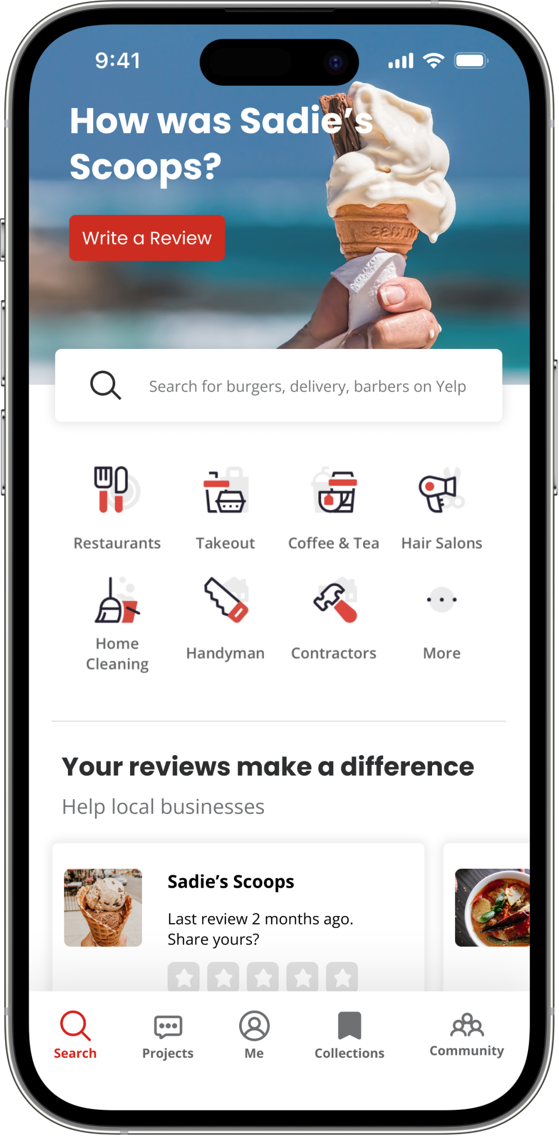
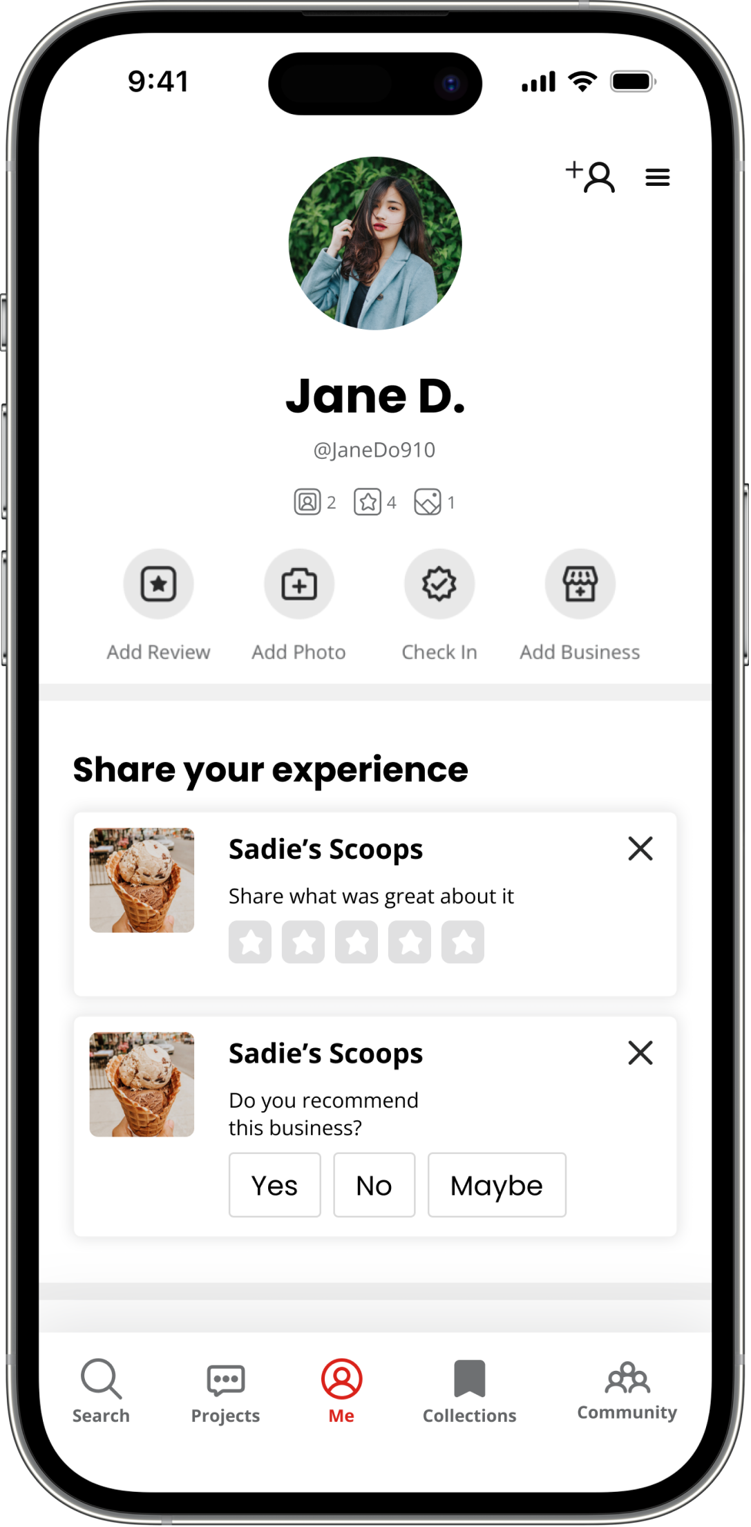
Yelp Community is an addition to the Yelp social app, designed to connect users with their friends, build trust in online reviews, and increase appeal of the app to a younger user demographic.
Connect a traveler to a service provider or another traveler
5 weeks
Kassidy Tran, Jason Lopez, Sofia DaSilva, Judy Roh, Vanessa Espinoza
Figma, Google Workspace, Zoom
UX designer, project manager
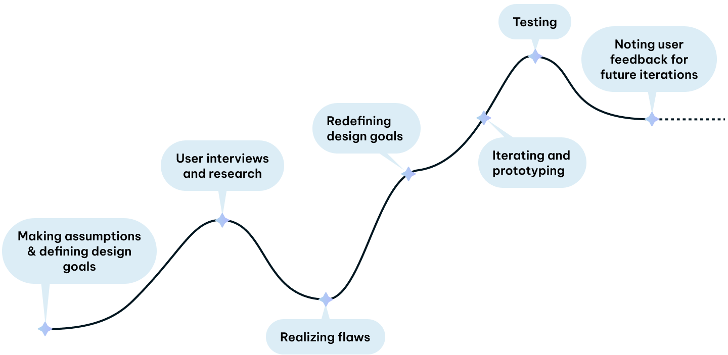
We started by making assumptions about travelers:
These initial assumptions led us to what we believed was the problem:
How might we create a social media platform that encourages travelers to explore local destinations with visual information?
Jumping on the trends at the time, our team originally proposed to present locational information to travelers via user-generated short-form video content.
Based on our assumptions, we believed our target users were aspiring travel content creators and adventurous social media users. In order to validate these assumptions, we jumped into user research.
It only took five user interviews and additional survey responses for us to discover major conflicts between our proposed solution and the actual goals and motivations of our users.
Following our primary user research, it was clear we failed to properly empathize with our users. We needed to pinpoint the underlying reasons behind our users' negative feedback towards our travel app concept. I organized a group affinity mapping session, where we discovered common themes among users' concerns.
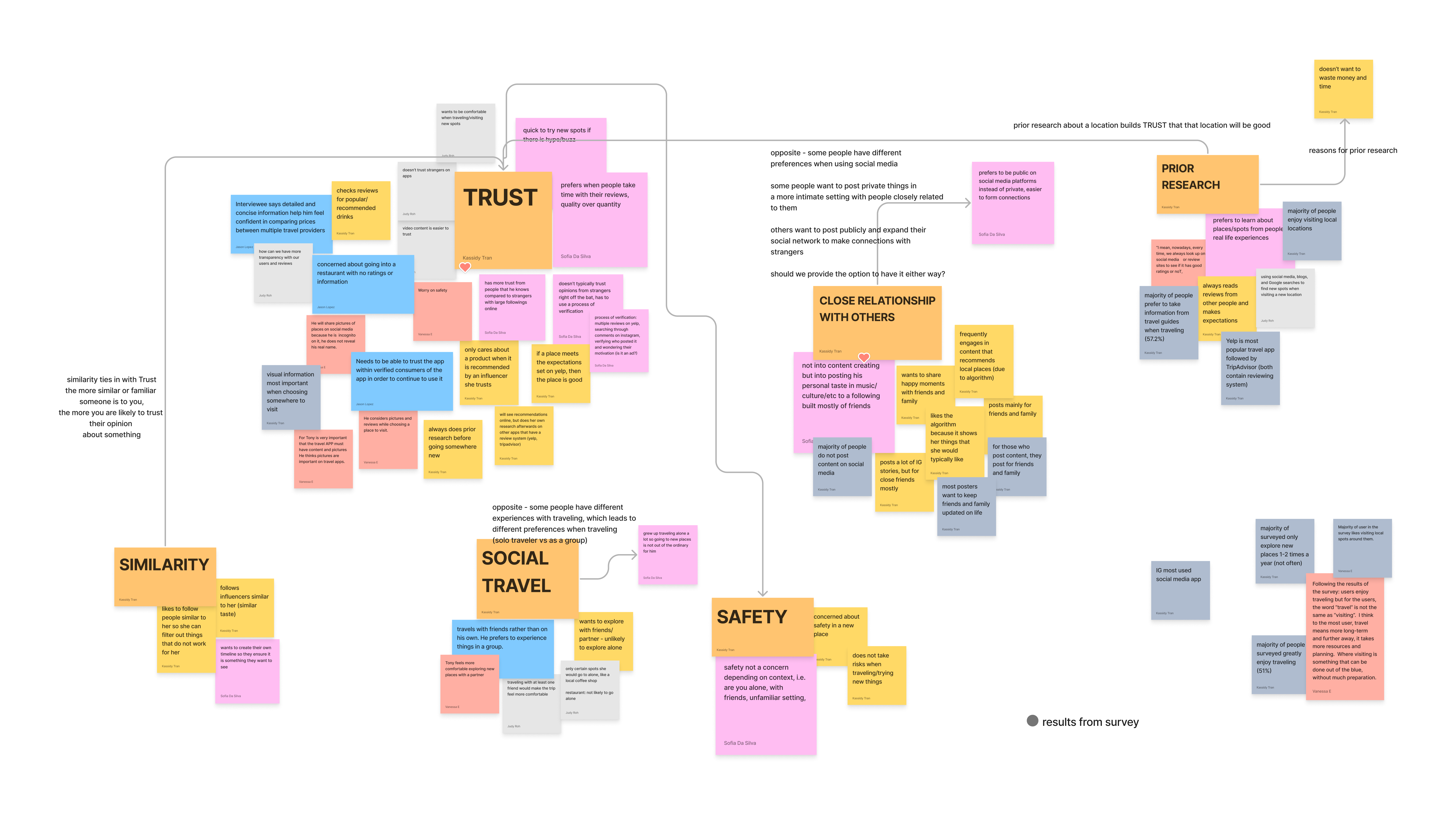
I typically don't just like see one video from someone and then immediately trust their recommendations.
- Female, age 23
"I don't really check out different places solo…safety is one of the biggest concerns for most women…."
- Female, age 22
"I downloaded Yelp and I was searching for popular places...the experience was actually pretty good…"
- Male, age 19
Based on these insights, it was evident we needed to take a step back and rethink our approach to the problem space.
Our mistake was making assumptions about the user before conducting appropriate user research. Users had more issues with the trustworthiness of recommendations rather than the need for recommendations.
How might we create a trust-based community that sets appropriate expectations and reduces the time users spend on prior research on new locations?
We backtracked and redefined our design goals based on insights from user research.
We planned to take advantage of our users’ social relationships. Usually, people share similar preferences to their friends - by knowing their friends’ likes and dislikes, users can form more accurate expectations of how they themselves will feel about a business. By allowing users to read their friends' words, we can improve trust in reviews.
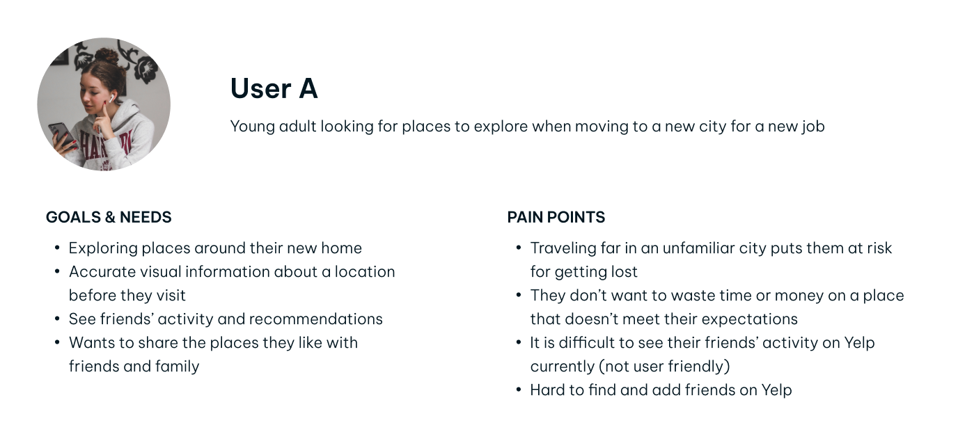
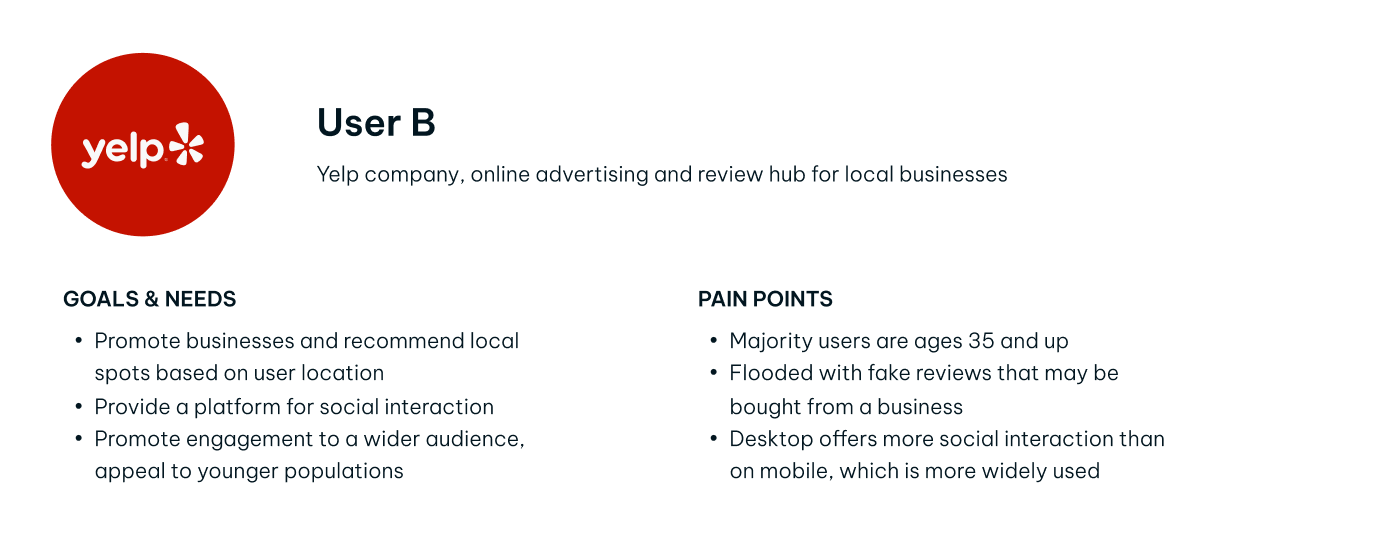
Our behavioral archetypes were iterated to reflect our users’ needs and the company’s goals:
Three features we prioritized as necessary to improve the user experience of the app included -
We re-organized the bottom navigation menu, replacing the “More” menu item with a “Community” menu item. The contents under the previous “More” menu item were moved to the profile page. This adds a clear, easily noticeable pathway to the social page of the app.


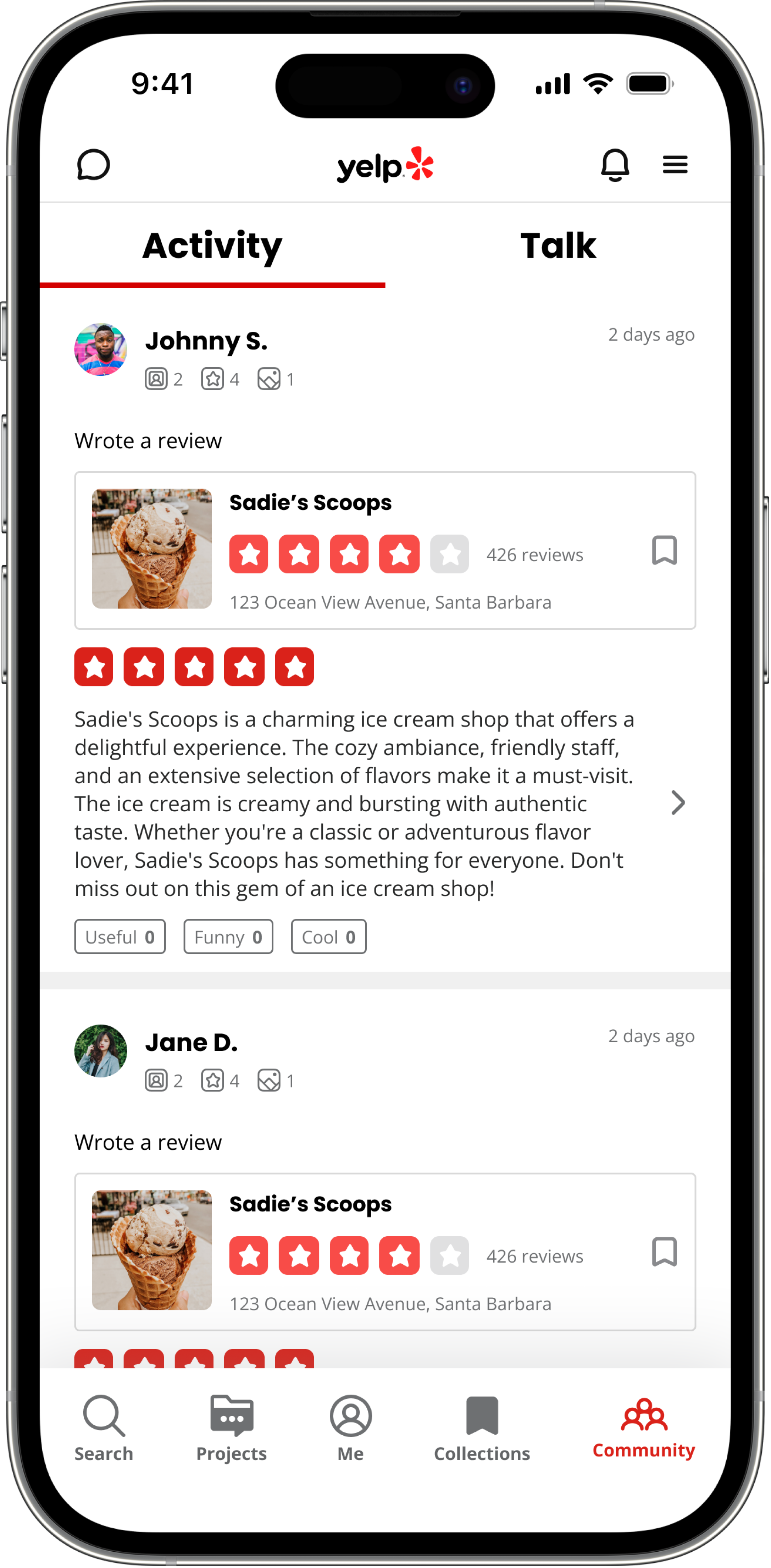
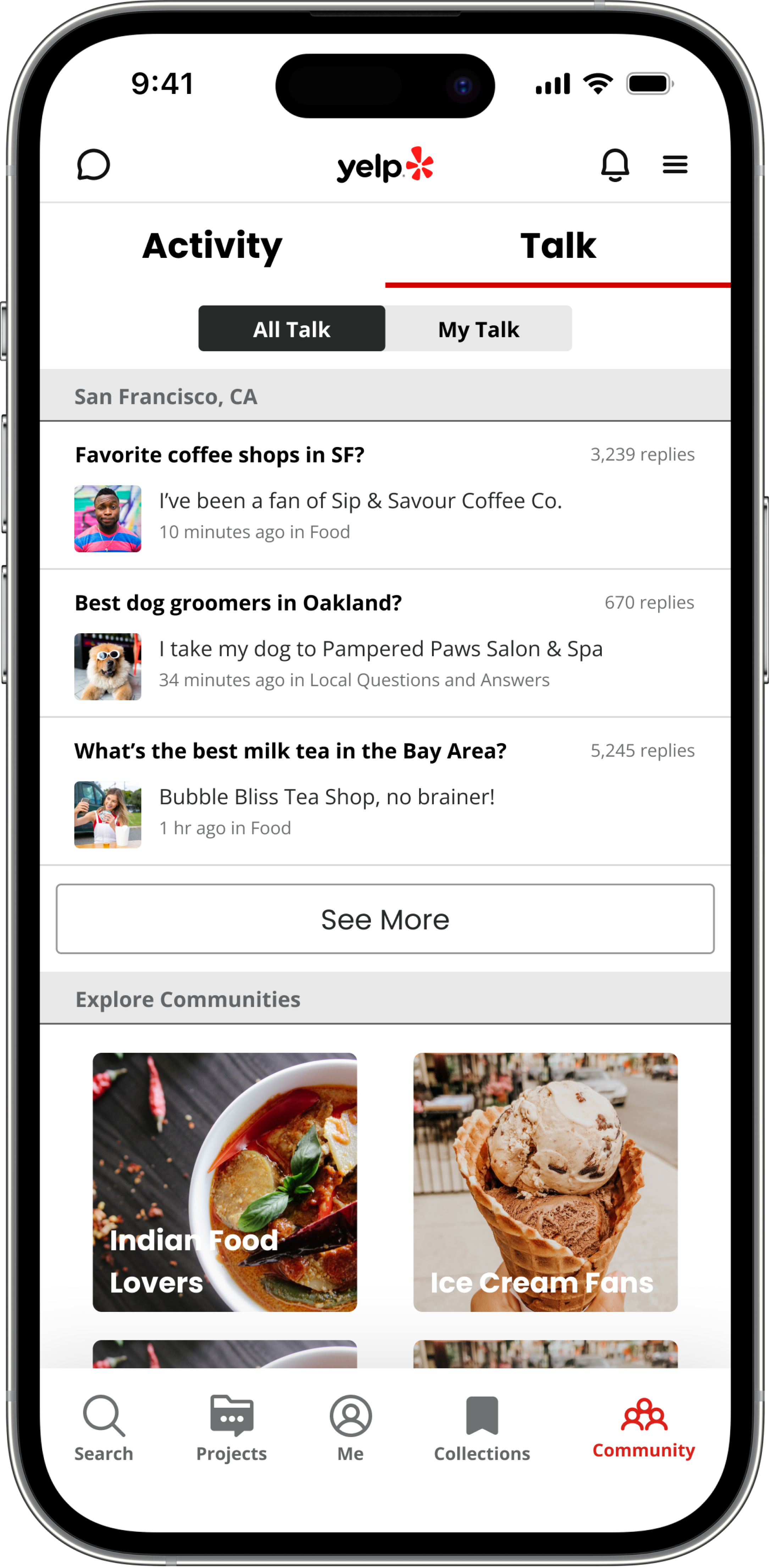
Our new “Community” page was divided into two sections: an “Activity” section and “Talk” section.
In the Activity section, users can view their friends’ reviews, check-ins, and social activity. We took inspiration from the UI of popular social platforms like Twitter and Facebook, and also incorporated features of Yelp's existing UI patterns, to ensure the design is intuitive and doesn't stray too far from Yelp's current branding.

The Talk section provides users a platform to join forums to talk about different topics, or socialize with other Yelp users in their local area. This feature exists on the Yelp platform currently, but is located under the "More" tab, and therefore not well-known to users.

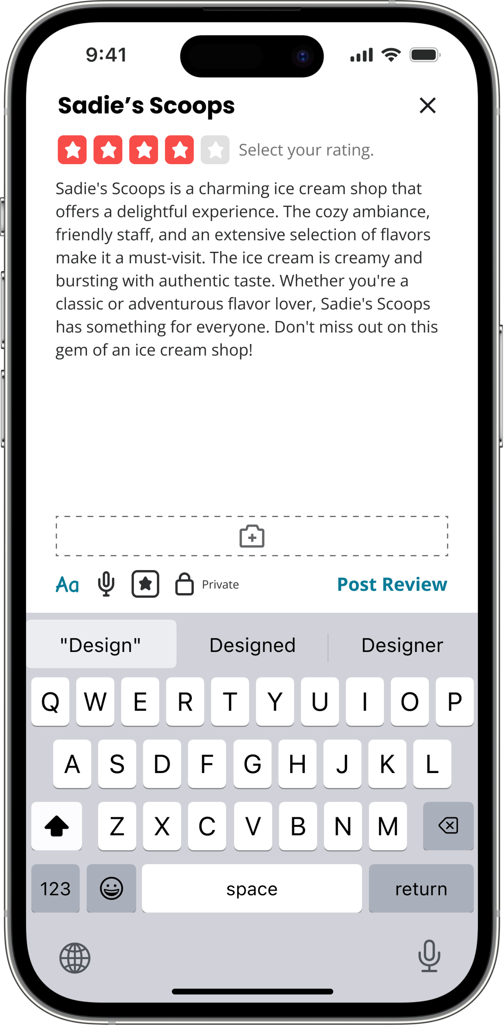
We made a key design decision to add privacy for reviews. Many users mentioned that they preferred to post just for their close friends rather than for strangers, so we added an option to toggle review visibility. The intent behind this design was to encourage and incentivize users to post more frequently, without the need to worry about strangers who might read their posts.
A review that is marked private before posting will be seen only by friends of the user, and the star rating will not contribute to the businesses public star rating.

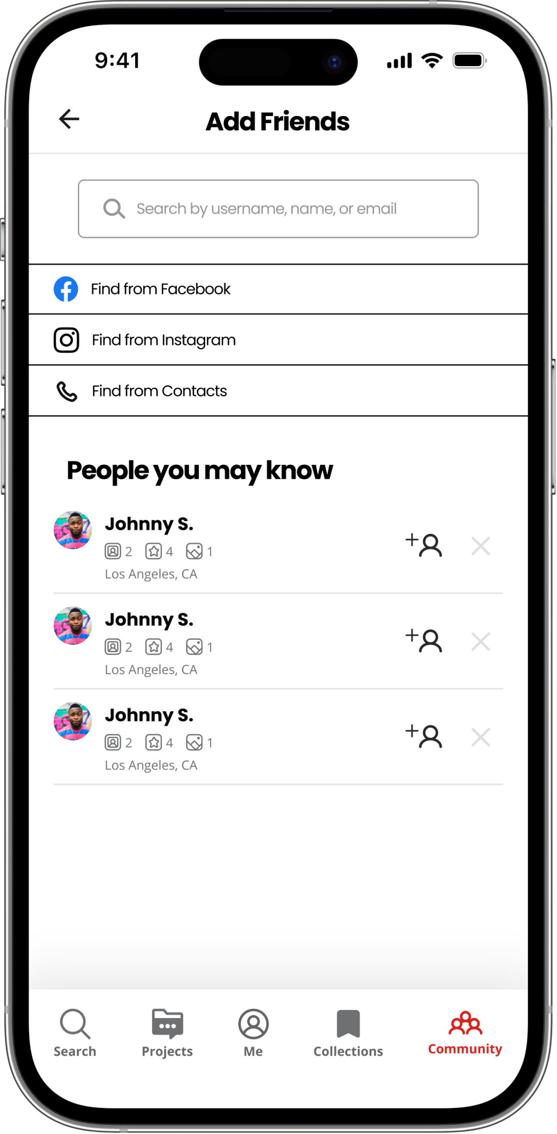
The user flow to add friends was also modified to include less clicks. Now, each user has their own unique username. Users can add friends by going to their profile page and clicking on the + icon, then search their friends’ usernames to add them. This method of searching by username is more efficient and intuitive to seasoned social media users, compared to the current process, in which users needed to search by first name and last initial, then filter by city.

When testing our prototype, we found success in that users felt:
However, there were also a few areas for improvement:
My team and I made a huge mistake by defining the problem and ideating solutions before doing adequate research. When we hit a roadblock in our design process, we realized that we needed to take a step back to analyze user insights and redefine our problem space. Listening to our users led us back on track to designing a solution that would actually target users’ pain points. This was a great lesson learned on the value of user research and how to quickly adapt to unexpected outcomes.
While it is important to consider the user’s perspective, my team and I also needed to consider the costs and benefits of this design to Yelp as a company. I constantly asked myself, “What value would this product bring to Yelp and its users?” when choosing which features to prioritize during iteration. It was crucial for me to learn the importance of viewing the problem space from different perspectives and designing a solution that addresses both stakeholder and user needs.